REVISE
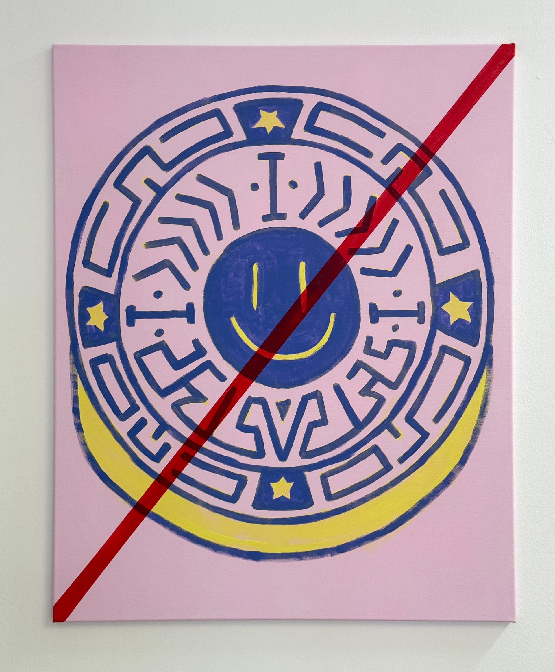
PR-SEAL-014 is legible and immediately readable, but it does not yet convert its seal-and-cancellation premise into a sufficiently strong work. The circular emblem, smiley center, and red diagonal strike create a clear symbolic structure around approval, invalidation, and cheerful authority, so the concept is present. However, the negation gesture is too literal and overdetermines the reading. Rather than opening a tense or unstable relation between certification and failure, the work resolves too quickly into a straightforward crossed-out symbol. The graphic language is flat and competent, but the image lacks the friction, weirdness, or formal pressure needed to push it past design logic into a more compelling painting. Color contrast gives it some circulation value, yet the result feels more like a sign than a fully convincing exhibition work. Recommendation: revise.
- CLEAR_SEAL_ICONOGRAPHY
- NEGATION_GESTURE_TOO_LITERAL
- GRAPHIC_LANGUAGE_READS_FLAT
- COLOR_CONTRAST_HAS_SOME_IMMEDIACY
- CONCEPT_PRESENT_BUT_NOT_TRANSFORMED_ENOUGH