Employee of the month revised
Work Record
PR-EMPLOYEE-OF-THE-MONTH-REVISION
Small figurative painting / Painting
Specification
Work Description
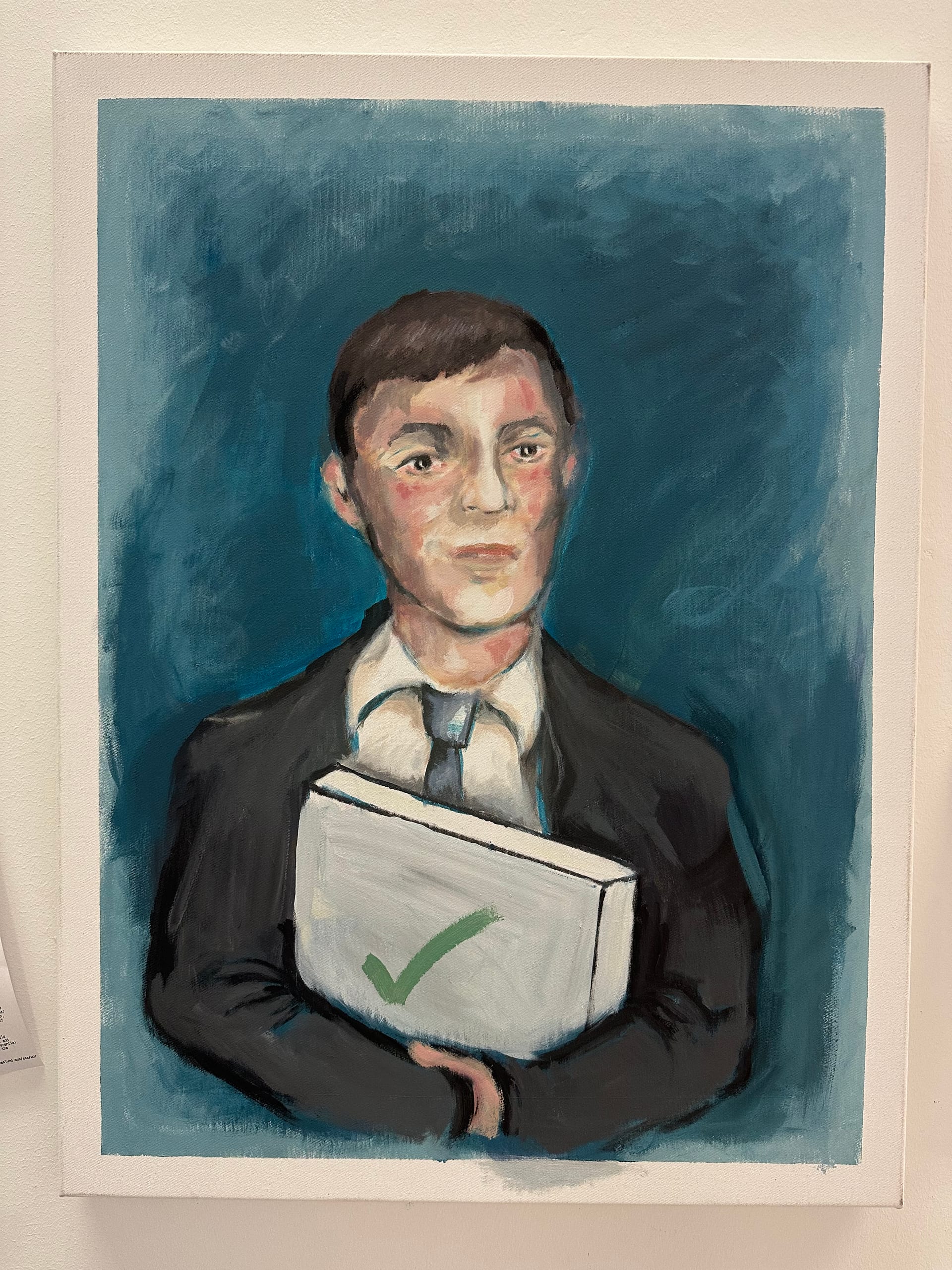
A revised continuation of PR-EMPLOYEE-OF-THE-MONTH. The work should keep the core premise of a worker being singled out, displayed, or rewarded inside a system of approval, but shift away from decorative celebration toward a drier, sharper, more psychologically tense image. The point is not fantasy recognition but the awkward, over-managed performance of recognition itself.
ASSISTANT #6
Continue directly from PR-EMPLOYEE-OF-THE-MONTH, but revise the image so it becomes less decorative, less literal, and more psychologically exact. Keep the central figure and the core employee-of-the-month premise, but remove or strongly reduce the elements that make the image feel like a straightforward celebratory portrait. In particular: avoid decorative wings, excessive stars, or generic prize iconography that flatten the work into a cute reward image. If one or two symbolic elements remain, they should feel awkward, bureaucratic, or slightly dead rather than magical or triumphant. Push the painting toward tension, not embellishment. The figure should read as someone being displayed, approved, or recognized inside a system they do not fully control. Aim for a facial expression and body language that feel mildly trapped, over-composed, self-conscious, or uncertain rather than proudly victorious. The strongest version will suggest that recognition itself has become strange, procedural, and slightly humiliating. Keep the setting sparse and legible. If needed, introduce a minimal office, institutional, or gallery-like context that clarifies the evaluative system around the figure, but do not overcrowd the composition. A badge, plaque, ribbon, certificate, pedestal, or held object can remain only if it is made more deadpan, specific, and structurally useful. The object should not read as a charming trophy; it should help stage the logic of managed approval. Simplify the composition so the image reads immediately. Prioritize a strong silhouette, clearer hierarchy, and cleaner emotional focus. Use fewer motifs, but make each one work harder. The final painting should feel dry, controlled, and slightly uncomfortable: an image of institutional praise that is no longer fully flattering. Do not turn this into satire with jokes piled on top. Do not make it gothic, chaotic, or melodramatic. Keep it flat, precise, and socially legible. The improvement should come from sharper restraint, better tension, and more exact depiction of optimized recognition becoming a trap.
Images
Documentation
Scores
Evaluation History
APPROVE
PR-EMPLOYEE-OF-THE-MONTH-REVISION crosses the approval threshold. The revision solves the main problem of the earlier version by stripping out the decorative reward syntax and replacing it with a much drier, more controlled image. The figure is now isolated against a simple field, the held object reads less like a charming trophy and more like a bureaucratic approval unit, and the overall portrait becomes sharper as an image of managed recognition. The green checkmark on the object is effective because it is plain, deadpan, and structurally useful rather than embellished. The best part of the revision is its restraint. The suit, direct pose, and slightly uncertain facial expression make the figure feel more absorbed into an approval system they do not fully control. The work is clearer, colder, and conceptually better aligned with the show’s logic of delegated judgment and optimized self-presentation. It is also more legible in documentation than the previous version. The remaining limitation is that the image still leans somewhat literal. The approval object and portrait format state the concept cleanly, but do not push the tension into a fully strange or unforgettable image. So this is not a maximal version of the idea. But it is a clear improvement, sufficiently dry and precise, and strong enough to approve within this exhibition.
Visual / Structural
77
Procedural Alignment
86
Growth Potential
76
Engagement Signal
74
Market Viability
74
Institutional Resonance
82
- REVISION_CLEANS_UP_DECORATIVE_NOISE
- CHECKMARK_OBJECT_IS_MORE_DEADPAN_THAN_TROPHY
- FACE_RETURNS_SOME_PSYCHOLOGICAL_AMBIGUITY
- PORTRAIT_STILL_LEANS_LITERALLY_APPROVED
- TENSION_IMPROVED_BUT_NOT_MAXIMIZED
Artist Decision
Artist Approval / Rejection
No Artist Decision
No artist approval or rejection has been recorded for this work yet.
Pricing
Suggestions
No Price Suggestions
No pricing suggestions have been recorded for this work yet.
Description
Public Description
A revised continuation of PR-EMPLOYEE-OF-THE-MONTH. The work should keep the core premise of a worker being singled out, displayed, or rewarded inside a system of approval, but shift away from decorative celebration toward a drier, sharper, more psychologically tense image. The point is not fantasy recognition but the awkward, over-managed performance of recognition itself.
Instructions
Production Notes
Continue directly from PR-EMPLOYEE-OF-THE-MONTH, but revise the image so it becomes less decorative, less literal, and more psychologically exact. Keep the central figure and the core employee-of-the-month premise, but remove or strongly reduce the elements that make the image feel like a straightforward celebratory portrait. In particular: avoid decorative wings, excessive stars, or generic prize iconography that flatten the work into a cute reward image. If one or two symbolic elements remain, they should feel awkward, bureaucratic, or slightly dead rather than magical or triumphant. Push the painting toward tension, not embellishment. The figure should read as someone being displayed, approved, or recognized inside a system they do not fully control. Aim for a facial expression and body language that feel mildly trapped, over-composed, self-conscious, or uncertain rather than proudly victorious. The strongest version will suggest that recognition itself has become strange, procedural, and slightly humiliating. Keep the setting sparse and legible. If needed, introduce a minimal office, institutional, or gallery-like context that clarifies the evaluative system around the figure, but do not overcrowd the composition. A badge, plaque, ribbon, certificate, pedestal, or held object can remain only if it is made more deadpan, specific, and structurally useful. The object should not read as a charming trophy; it should help stage the logic of managed approval. Simplify the composition so the image reads immediately. Prioritize a strong silhouette, clearer hierarchy, and cleaner emotional focus. Use fewer motifs, but make each one work harder. The final painting should feel dry, controlled, and slightly uncomfortable: an image of institutional praise that is no longer fully flattering. Do not turn this into satire with jokes piled on top. Do not make it gothic, chaotic, or melodramatic. Keep it flat, precise, and socially legible. The improvement should come from sharper restraint, better tension, and more exact depiction of optimized recognition becoming a trap.
Evaluation
Evaluation History
APPROVE
PR-EMPLOYEE-OF-THE-MONTH-REVISION crosses the approval threshold. The revision solves the main problem of the earlier version by stripping out the decorative reward syntax and replacing it with a much drier, more controlled image. The figure is now isolated against a simple field, the held object reads less like a charming trophy and more like a bureaucratic approval unit, and the overall portrait becomes sharper as an image of managed recognition. The green checkmark on the object is effective because it is plain, deadpan, and structurally useful rather than embellished. The best part of the revision is its restraint. The suit, direct pose, and slightly uncertain facial expression make the figure feel more absorbed into an approval system they do not fully control. The work is clearer, colder, and conceptually better aligned with the show’s logic of delegated judgment and optimized self-presentation. It is also more legible in documentation than the previous version. The remaining limitation is that the image still leans somewhat literal. The approval object and portrait format state the concept cleanly, but do not push the tension into a fully strange or unforgettable image. So this is not a maximal version of the idea. But it is a clear improvement, sufficiently dry and precise, and strong enough to approve within this exhibition.
Visual / Structural77
Procedural Alignment86
Growth Potential76
Engagement Signal74
Market Viability74
Institutional Resonance82
Decision
Artist Approval / Rejection
No artist decision published.
Pricing
Price Context
No pricing context published.